Harbook+
Harbook从一家以图书起家的店升级成商品多元化的集合店,从芮欧百货搬迁至原为上海仪电厂的巨鹿路758。业主希望我们能对品牌做新的定位设计。
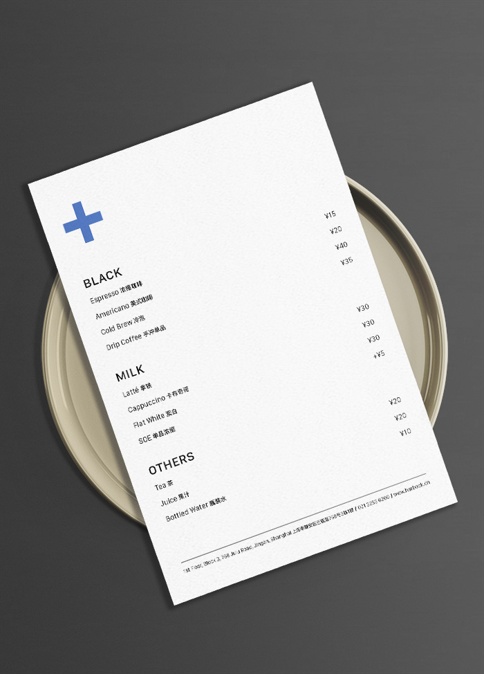
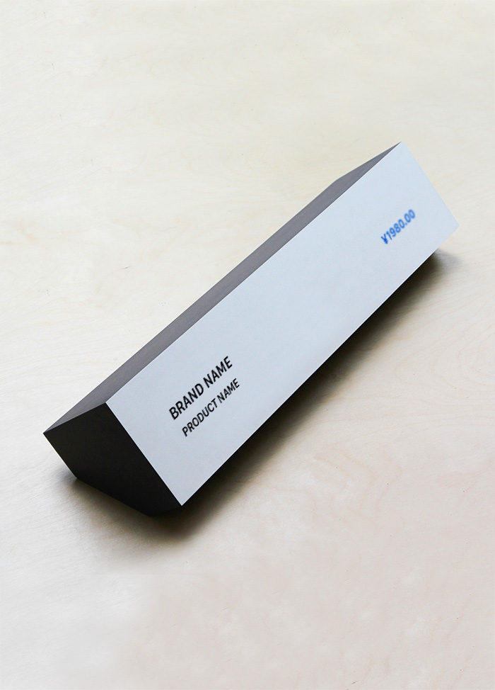
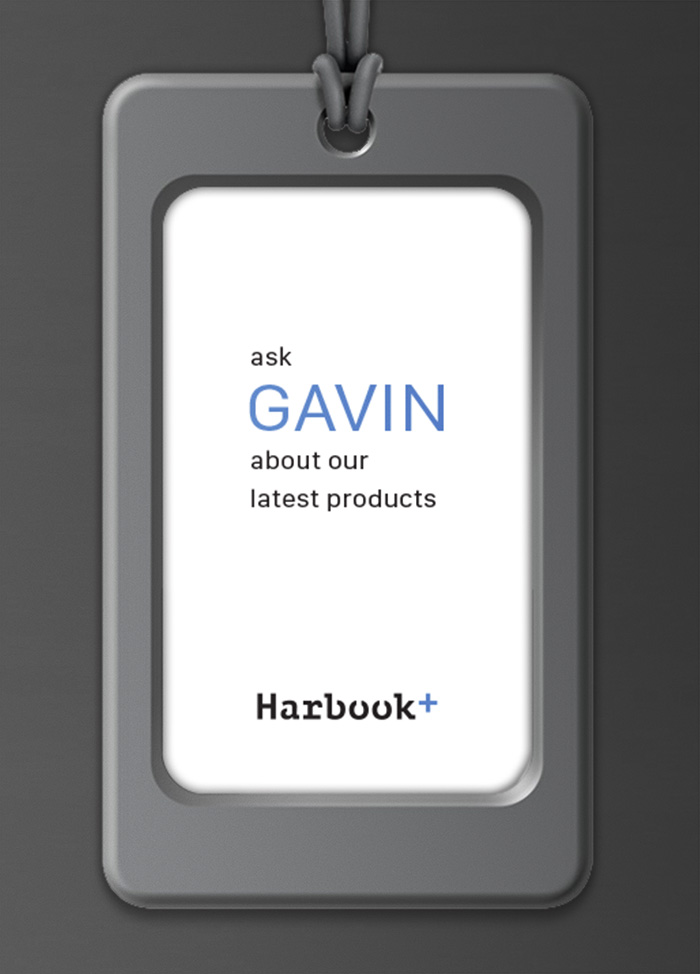
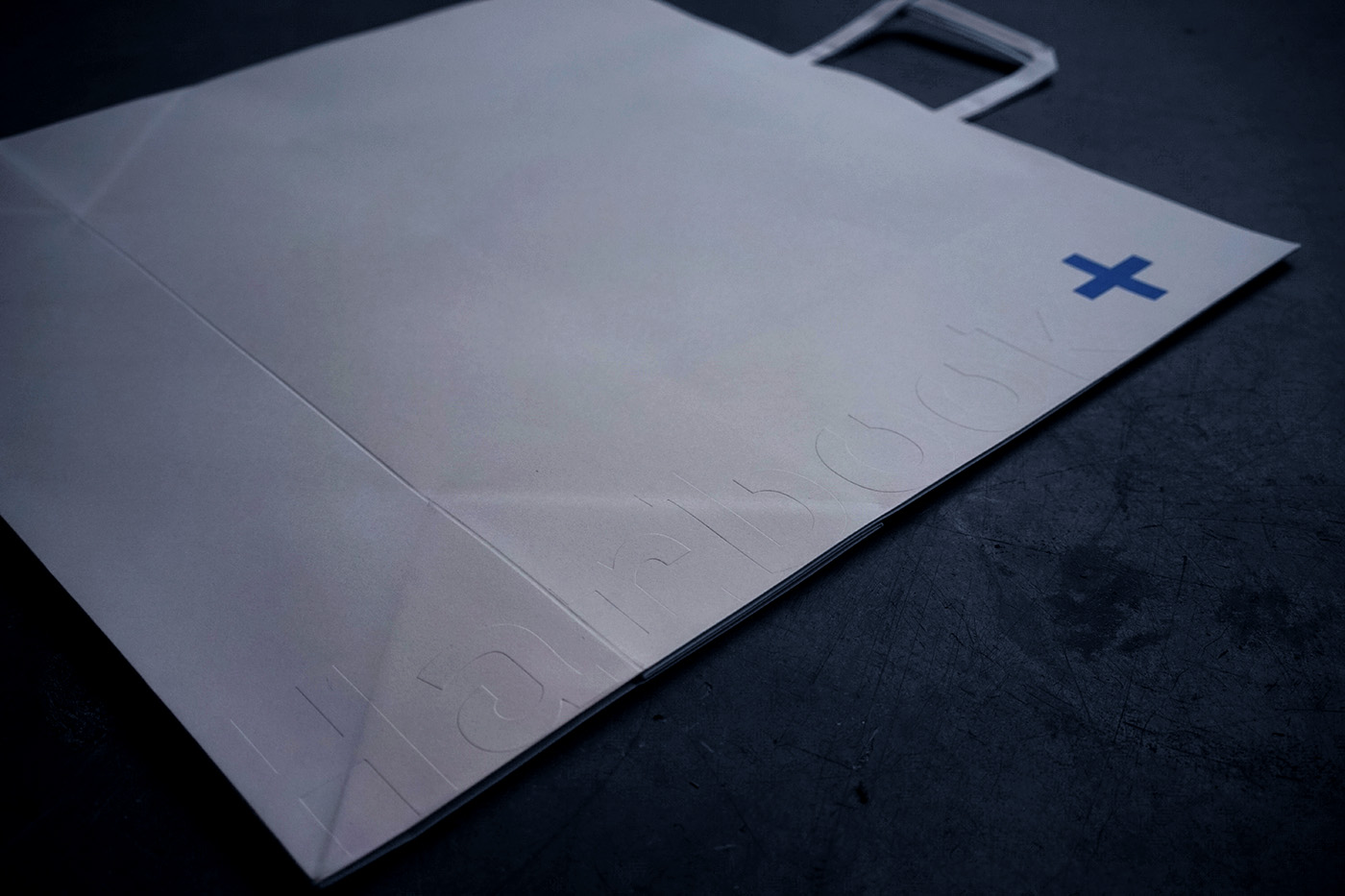
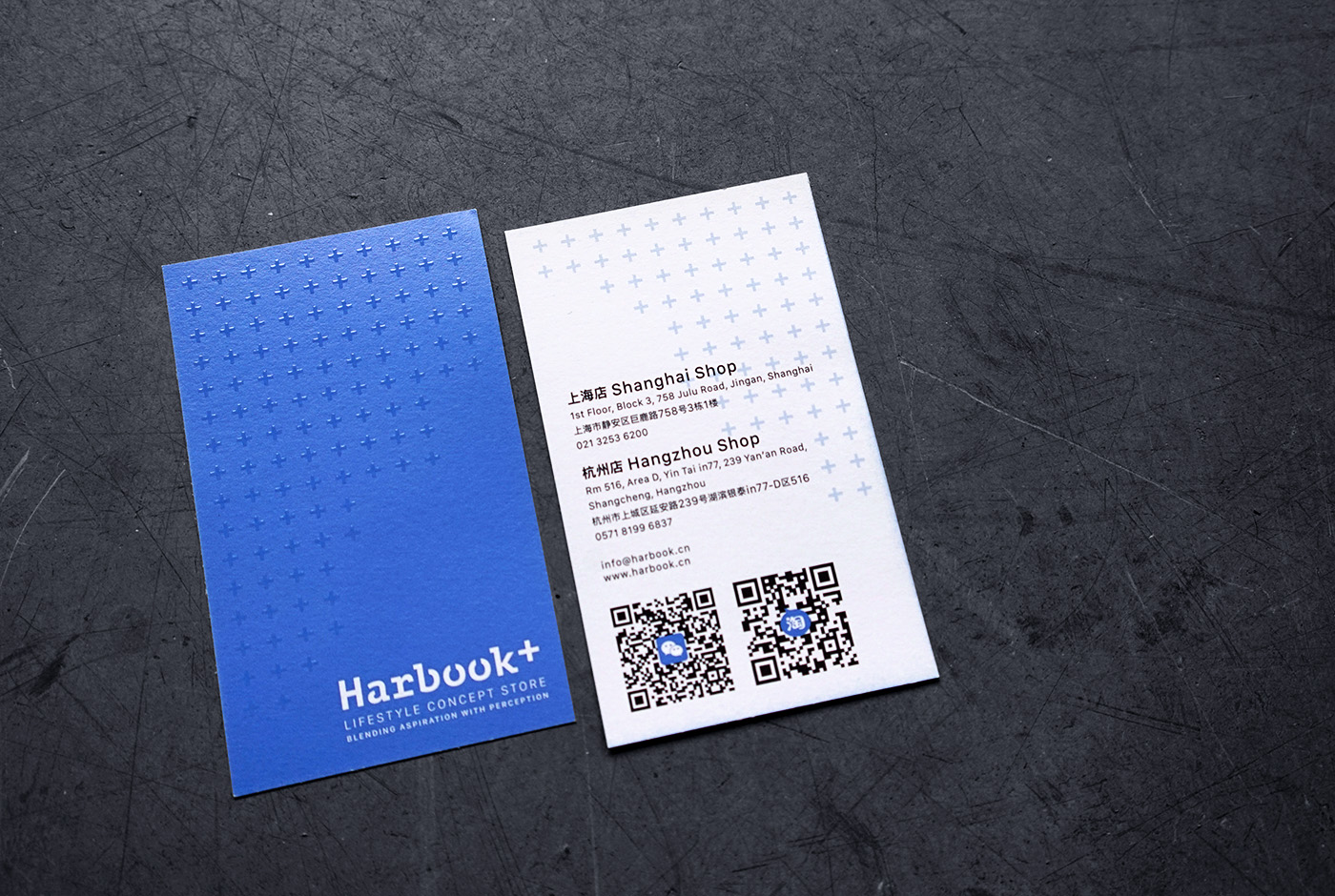
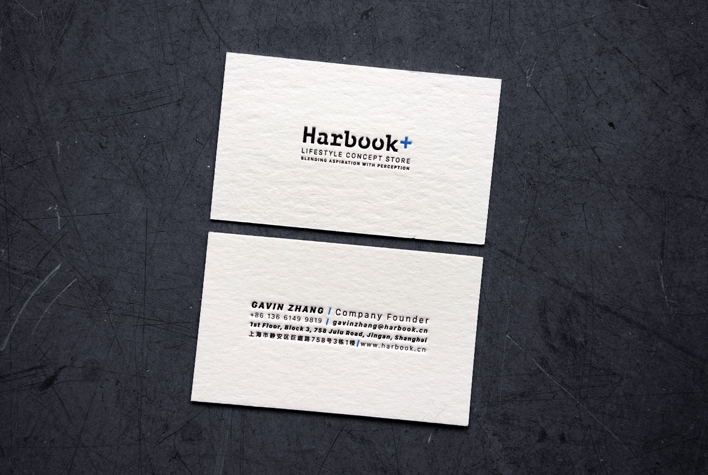
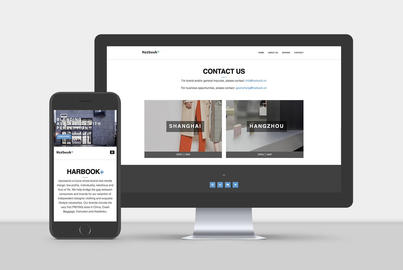
每个时代承载着时间的痕迹。我们希望致敬传统之余也对现代化包容。所以从字体与颜色的选择上实现了这个想法。元素上多次运用了原本标志中的那个“+”符号。“+”代表了更多的意思,象征着品牌从无到有,从少到多,从小到大的美好愿景。印刷材质上尝试了一些接近自然的质感的纸张,毕竟Harbook是从图书起家的,电子书盛行的时代,纸质书的触感让心和过去的距离更近一些。
With Harbook+ expanding from a bookstore to a lifestyle concept store and moving from Reel Mall to Julu758, which was once the Shanghai Electronic Instruments Factory, the owner hoped that we can help reposition their brand visuals to meet new needs.
Each era carries traces of time. We wanted to pay tribute to the classic as well as embracing the present. This concept was realised with the new choice of font and colour usages. We chose the “+” symbol in the original logo as a key repetitive visual element. “+” represented more than, symbolized the brand's vision from nothing to something or from small to large. For the printed collaterals, textured papers were chosen for its pureness. After all, Harbook started as a bookstore. In an era where e-books prevailed, the touch of paper books shortened our distances with the past.
 上海 SHANGHAI