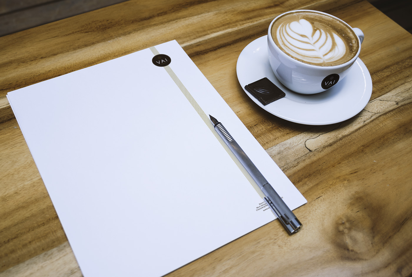
VAI Milano
2016 上海 SHANGHAI
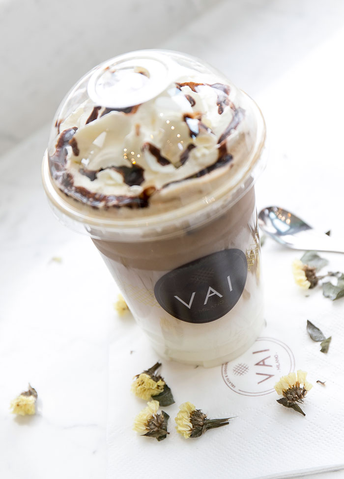
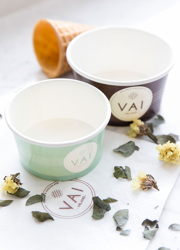
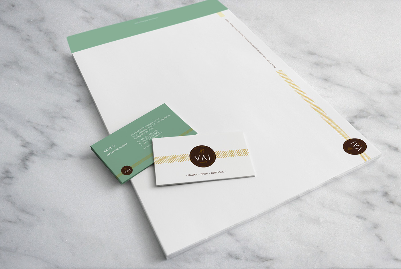
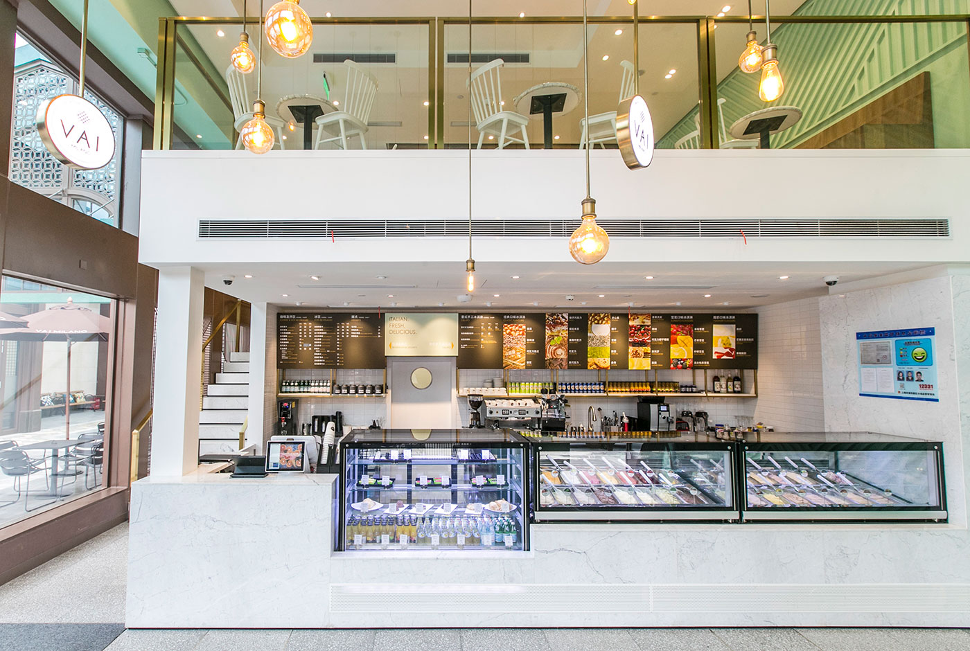
当客户邀请我们为他们的冰淇淋品牌翻新设计的时候,我们毫不犹豫地想利用冰淇淋的颜色作为灵感。我们为客户选择了四个主要的基础颜色:棕色与金色来保留传统的意大利风情;薄荷绿与白色来传达年轻和无忧无虑的氛围。这个想法是用柔和大胆的颜色来玩。 也用于区分不同种类的用途,例如,棕色冰淇淋杯用于盛巧克力口味,白色冰淇淋杯用于雪芭,薄荷绿色冰淇淋杯用于水果味的冰淇淋。
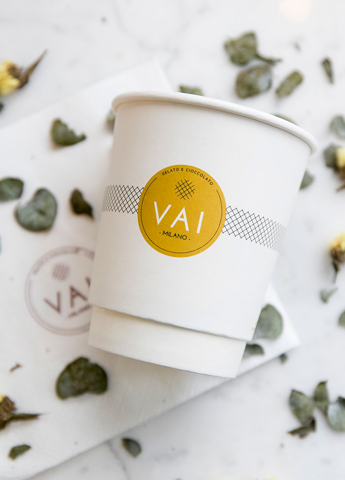
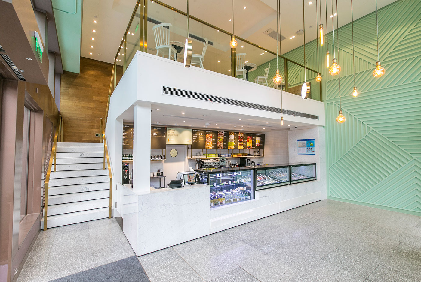
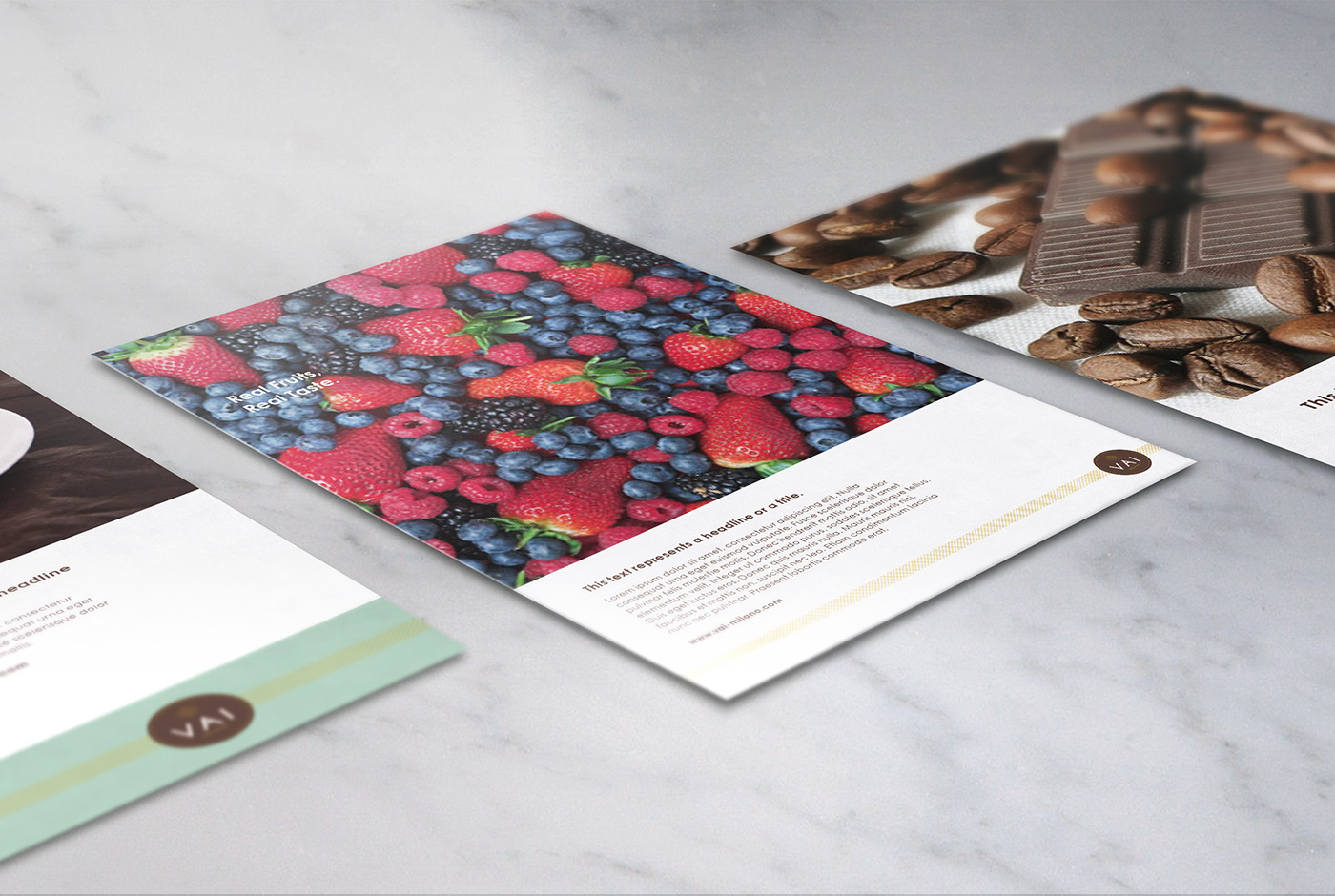
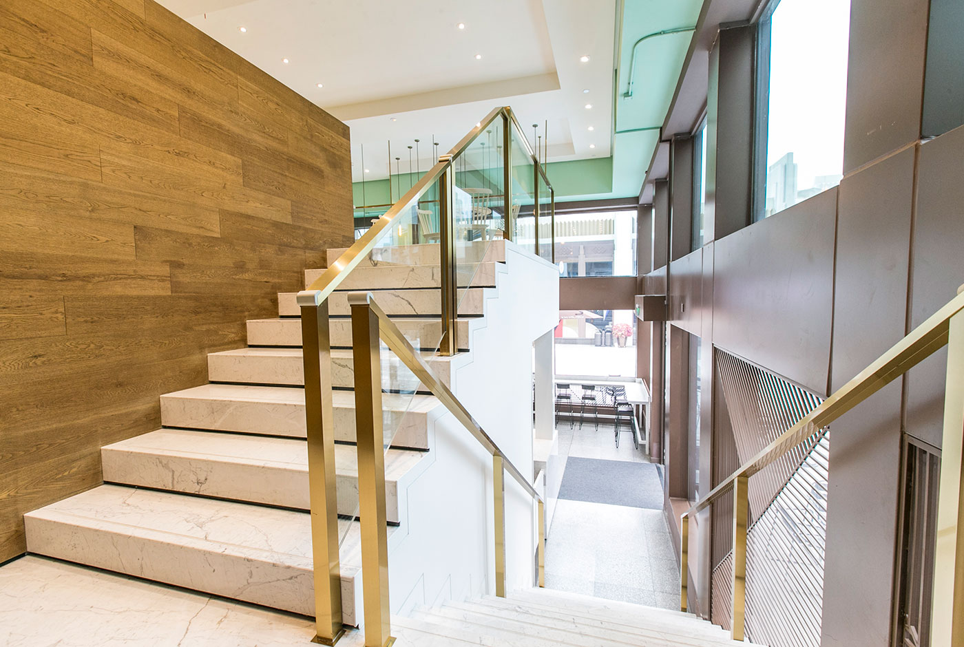
为了让顾客对其标识的印象更加深刻,宣传品和室内空间中更加一致,我们从他们的标志中挑选出小巧的十字交叉华夫格图案作为灵感,并大量应用于印刷品上与室内墙体一部分。这两个设计元素成为我们所有视觉应用,定制照明和选择性内饰细节的基本指南。
When approached by the client to give a facelift for their gelato brand, without hesitation, we wanted to use colors of the gelato as an inspiration. Four primary colors were selected: brown and gold to preserve that traditional feeling of an Italian delight; mint green and white to bring in the young and carefree vibe. The idea was to play with soft and bold colors alike. It was also used to distinguish different kinds of uses, for example, brown gelato cups for chocolatey flavors, white gelato cups for sorbets, and mint green gelato cups for fruity flavors.
To make the impression more consistent in all the graphic application as well as interior space, we took the small crisscross waffle pattern from their logo as inspiration, and applied it in the printed materials as well as the interior space as part of the large focal wall. These two design elements beaome our fundamental guideline for all visual applications, custom lighting and selective interior details.